Rubrik — Redesigning Anomaly Detection for 40% faster investigations
Rubrik helps businesses back up and quickly recover data if it's ever lost or hacked. Anomaly Detection feature flags unusual activity in enterprise data and alerts users. I was responsible for redesigning this feature to make it more efficient.
Impact
Reduce task completion time by 40% and the number of clicks by 33%

Anomaly Detection is a security monitoring feature that helps users identify and investigate potential ransomware attacks
Rubrik is a B2B cybersecurity company that helps enterprises protect and recover their critical data. Attackers typically threaten these enterprises with ransomware, which means encrypting essential files and demanding payment to unlock them. Anomaly Detection alerts security teams to unusual activity that may indicate ransomware attacks, so they can investigate and recover data quickly.
How Anomaly Detection looked before versus how it looks now
Detail Page
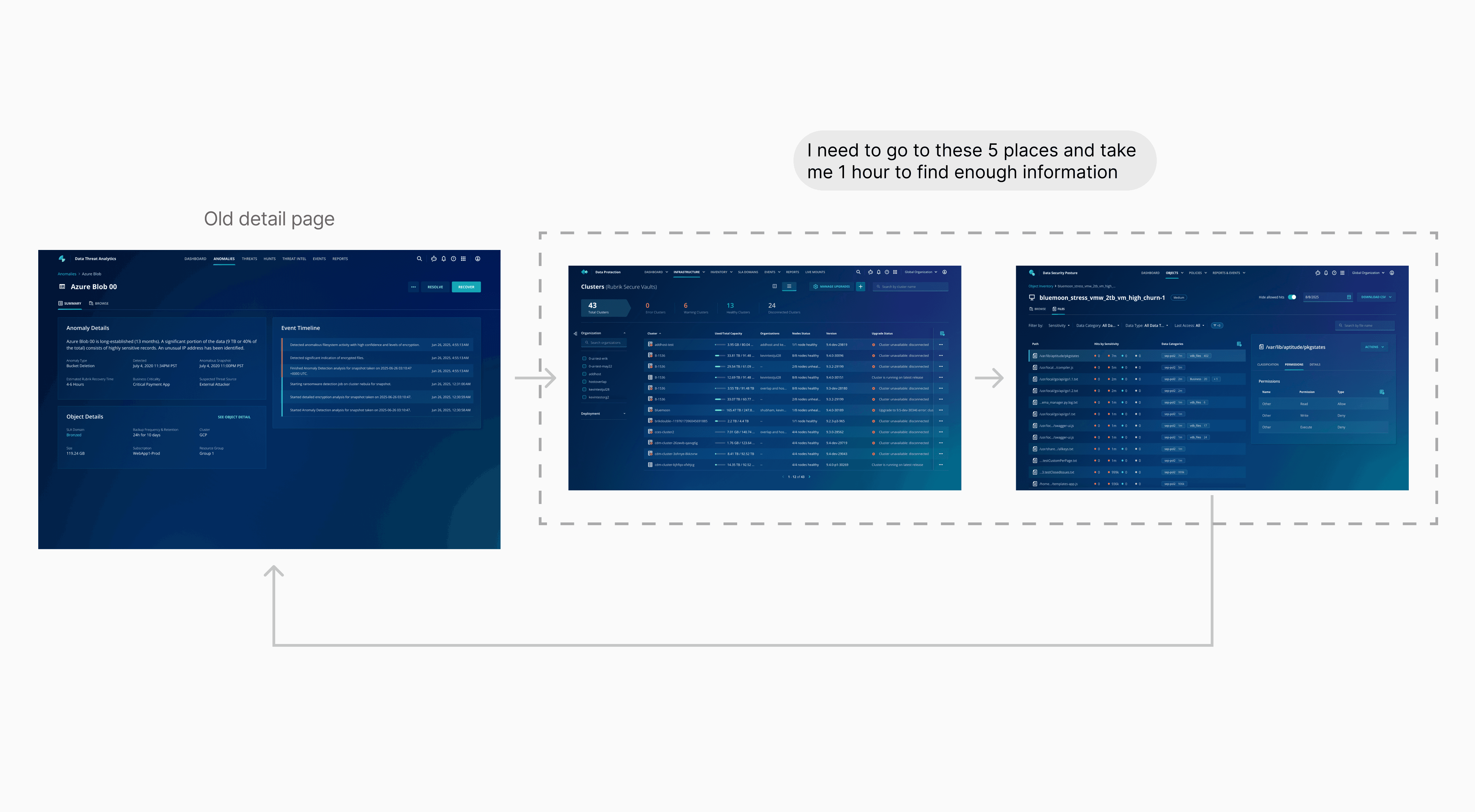
Key information was missing, making investigations slow and confusing
Users can now investigate with sufficient information in an intuitive order, faster and sleeker
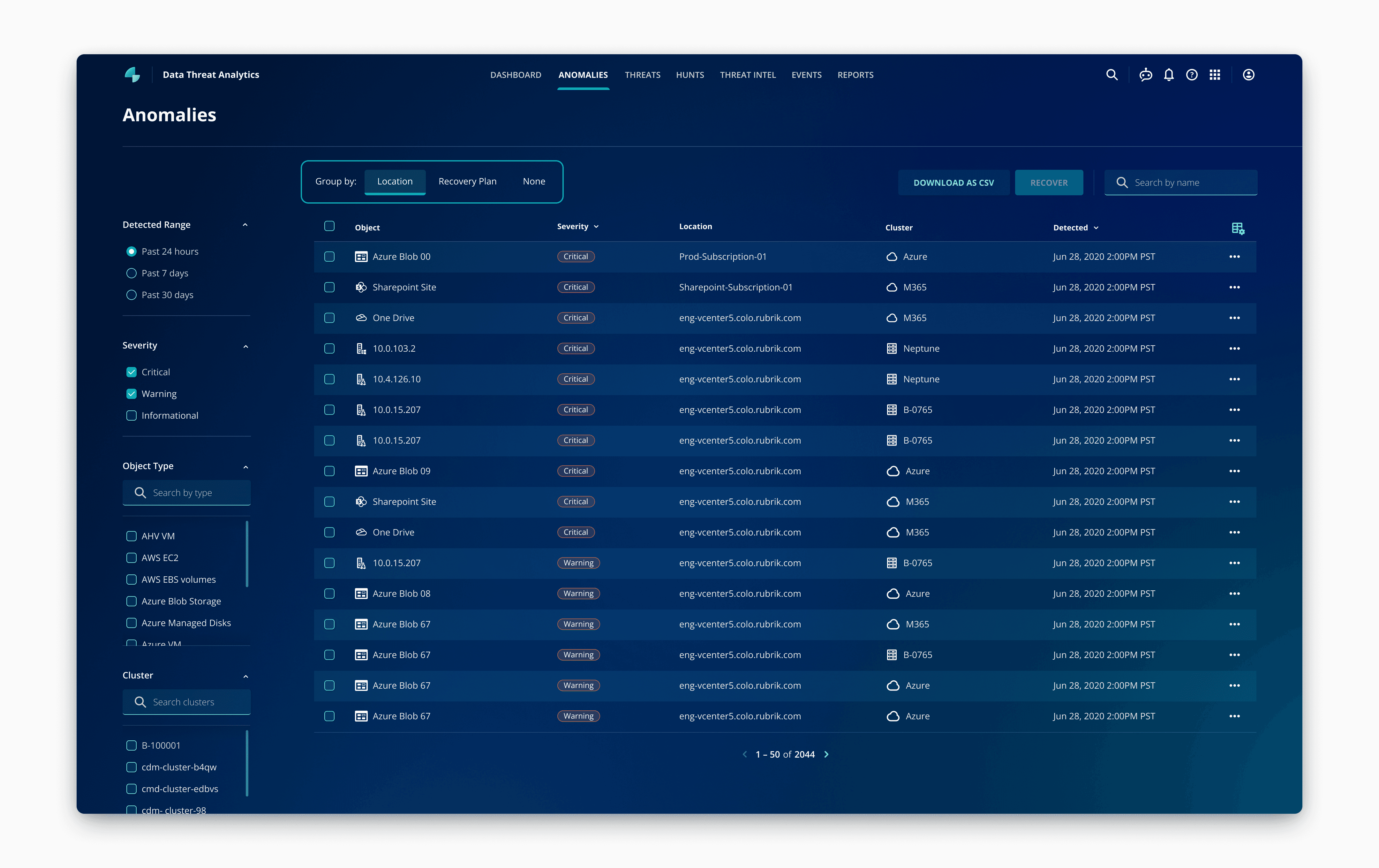
Listing Page
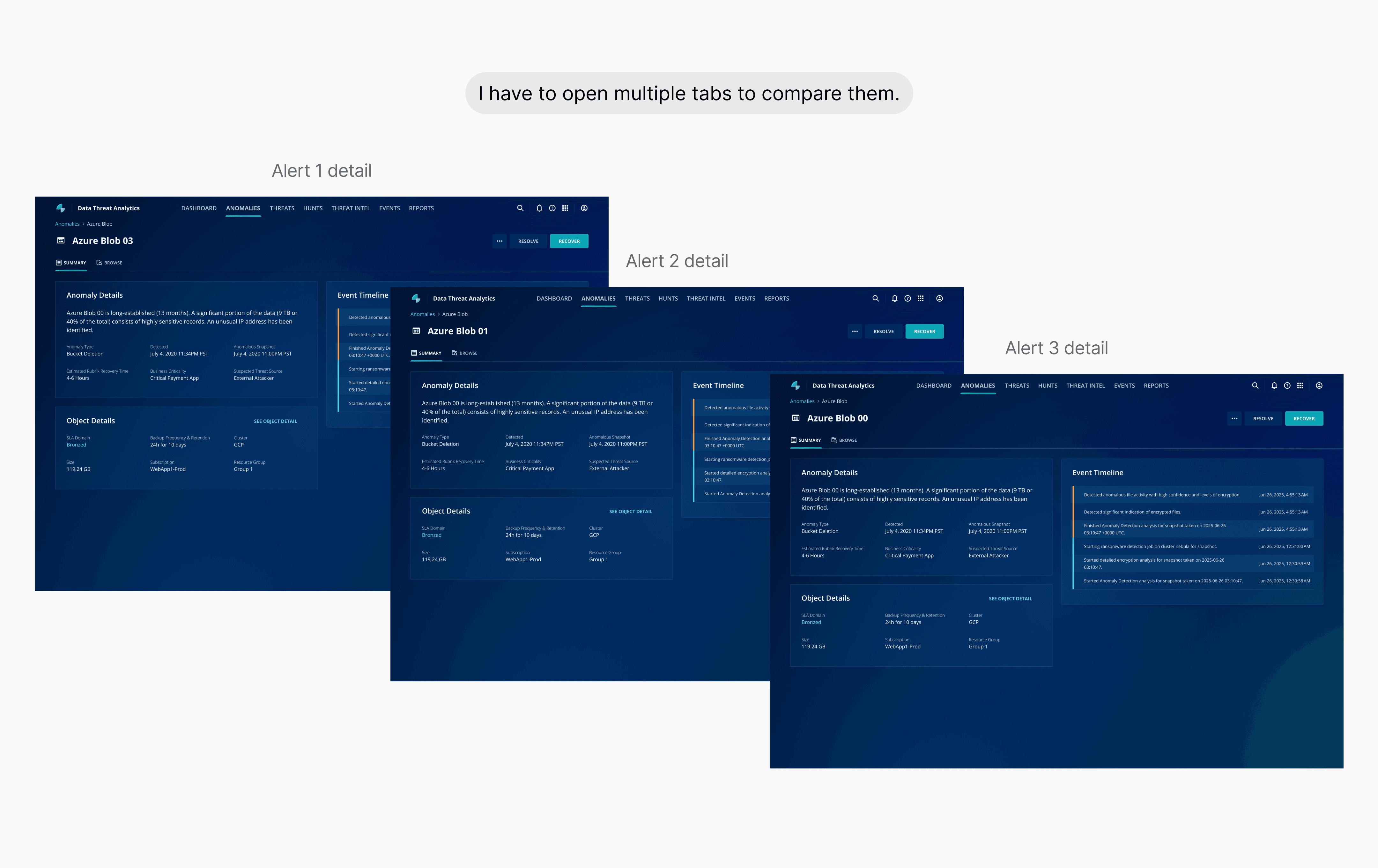
Users couldn’t easily compare or connect related anomaly alerts
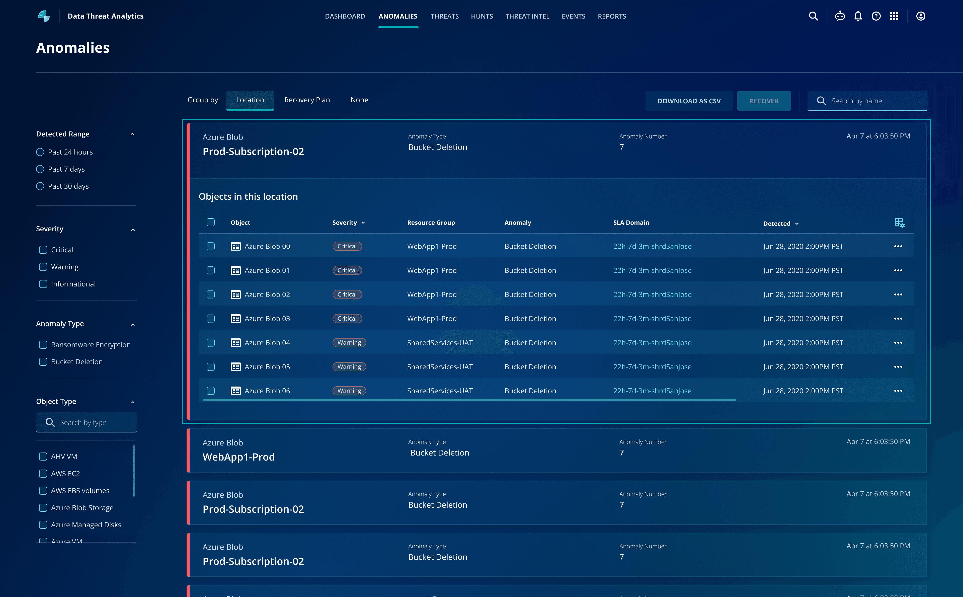
Users can now view related alerts in groups and compare them without opening multiple tabs

-33%
Number of clicks

-40%
Time on task

+20%
Customer satisfaction rate
Security analysts who must quickly decide whether an alert is a real attack
Core Goal:
Responsible for securing company data (PII, Client Data, Transaction Data)
Workflow:
They need to review a long list of anomaly alerts.
They must determine if the alerts are real attack.
Navigating a vague brief to define the root cause
Anomaly Detection feature has been launched for 6 months, and the product team flagged low user satisfaction. Starting with only a brief problem statement and limited user access, I ramped up quickly by interviewing Sales Engineers to bridge the knowledge gap. I combined this with past UXR reports and a process audit to pinpoint exactly where the friction lay.
Desk research
Reviewed past UXR reports to understand complaints

Internal Expert Interviews
Interviewed Sales Engineers to bridge the gap with users
Current process audit
Mapped the flow to pinpoint exactly where users struggled
Users couldn't connect related alerts or compare them easily

Users didn't have enough information on the detail page to decide if an anomaly was malicious
Users couldn't connect related alerts or compare them easily
Grouping related anomalies allows analysts to spot attack patterns instantly
I introduced a "Group By" function using dimensions like Location and Recovery Plan. Since ransomware attacks often spread through specific servers, this grouping matches the analyst's mental model, allowing them to assess bulk threats at a glance.
Prioritizing efficiency
I initially came up with the first concept. However, my mentor suggested creating a more visual version. Based on this feedback, I explored an alternative approach, shared it with the team for review, and ultimately decided to prioritize the efficiency.

Concept A
An accordion that shows a table of metrics
✓ More efficient to compare details of each anomaly
✗ Only have two ways of groupings
Concept B
An interactive diagram that visualizes groupings
✓ Compare different dimension
✓ Better visualization
✗ Inefficient to compare anomalies within the same group
Since the team decided to go forward with Concept A, the main challenge is that this accordion component does not currently exist in our design system
Aligning with engineering and the design system team on a phased solution
To meet the timeline, I worked with engineers and the design system team to break the solution into two phases. This allowed us to ship a usable experience immediately while preparing for a more scalable design system component.
With the new design, users can quickly group anomalies and find patterns
Users didn't have enough information on the detail page to decide if an anomaly was malicious
Retaining the current layout to minimize friction
To start, I considered whether we should design a new layout, so I reviewed the research data and discussed it with my PM. After our discussion, we decided not to update the current layout for two reasons:

Data Insight
Users spend equal time on different widgets

User Behavior
Users don't like drastic changes
Determine what information to include and how to present it in each widget
To understand what our target users think of each widget, I consolidated existing research and collaborated with 3 sales engineers to validate the information users expect to see.
Add “Recent Suspicious File”
Our search users struggle to map the entire story of an attack. To address this, I introduced an "Activity" diagram that enables users to easily and quickly visualize the story and identify patterns of spikes.
Add “Activity” to show files change spike
Users needed to understand how an attack evolved over time, not just static numbers. I chose the option 3 to highlight file change spikes and make attack patterns easier to recognize.
✓ Clearly compares different metrics for a single day
✗ Hard to track one metric's progress across multiple days
✓ Communicates the severity of an issue against a "Normal" baseline
✗ Lacks context; users can't tell if a high number is from a sudden spike or a gradual increase
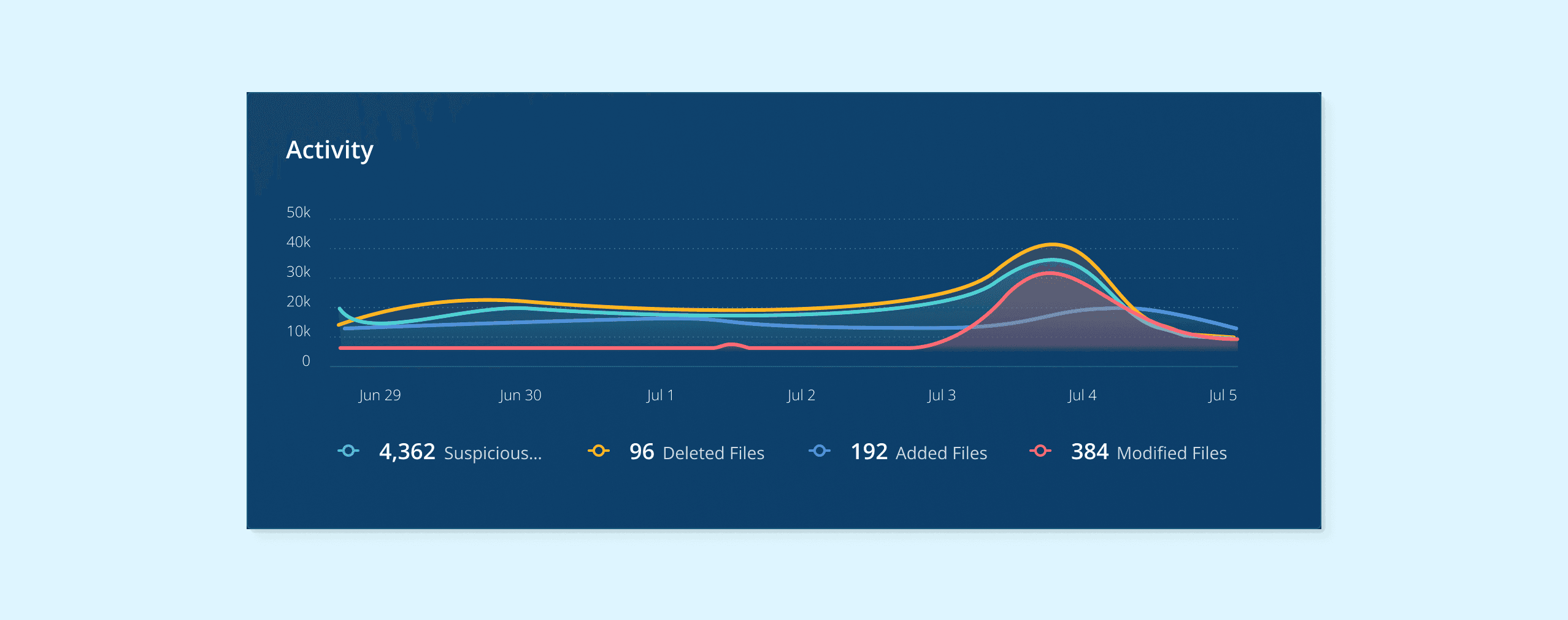
✓ Best for visualizing trends
With the redesigned experience, users can access enough context directly from the detail page to make faster decisions
User testing to quickly validate the new design
Participants
Security Analysts (n = 5) — provided by the Product Manager and Sales Engineers
Familiar with basic cloud security concepts (S3, IAM, Ransomware)
Daily work involves handling anomaly alerts
Method
Each participant needs to complete two sets of identical tasks (one set in the current platform, one set in the new prototype)
Results
-33%
Number of clicks
-40%
Time on task
Navigating ambiguity with proactive assumptions
I learned the importance of making informed assumptions and collaborated closely with PMs and engineers. Sales engineers were an invaluable resource, especially when we had limited access to users.
Understand the product before designing
As someone new to cybersecurity, I found it helpful to create a customized Gemini Gem to consolidate documentation and demos, and to ask questions. Design reviews were also a valuable opportunity to understand my colleagues' work.
Design Team Off-site Pottery
Up Next
